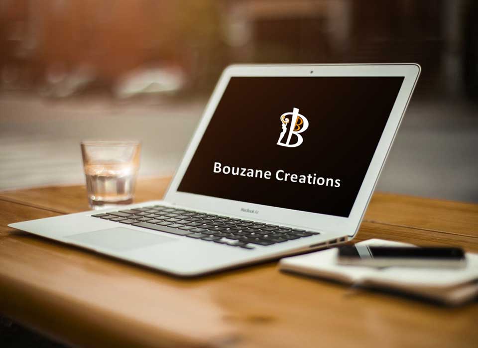
Just a few tips to keep in mind when you are creating a logo for your business. Remember it is or will be a part of your brand.
It's about Branding
Developing a logo for your business, non-profit or hobby interest is a BIG deal. It often is one of the first steps you take to build your ‘brand’. It’s about who you are, what you offer and unique to YOU.
What to Keep in Mind
There’s a whole science around branding that may be a bit overwhelming for someone just getting their feet wet in the marketing arena. BUT, don’t be discouraged. Here are some best practice tips that I recommend why you start your logo design:
- Simplicity (clean and uncluttered. In general, less is more and simplicity is more impactful)
- Memorability (easily recalled after just a glance. A glance, after all, is typically all your logo is going to get from most people.)
- Originality (Don’t settle for a me-too logo. Do a quick search of logos in your industry and look for patterns and avoid mimicking them)
- Modern Yet Timeless (“today,” but not so “today” that in five years your logo will look silly)
- Balance (The best logos are designed using principles of proportion and symmetry)
- Complementary (Your logo’s graphic device and your typeface should work together)
- Versatility (must be suitable for business cards, letterhead, invoices, website, social media; on both black and white backgrounds; good in large or small size)
 It was more than 30 years ago when I first started my business. At the time, I was totally focused on business and management consulting and was keen for my company to be seen as slick, efficient and knowledgeable. The original logo represented our commitment to assist businesses grow.
 As the business evolved and took on a broader scope, I realized it was more than just business growth but about support and creativity. The logo was changed to encompass all of that. Since then it has withstood the test of time. The logo is now part of my business and personal brand.
Some Design Tips
- Make a statement based on your brand and values.
- Understand your audience.
- Subtract unnecessary elements.
- Create it as a vector file.
- Use Pantone colors.
- Convey your meaning effectively.
- Don’t move forward unless it makes an impression.

